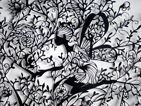
Caroline Jane Harris


This is the work of artist Caroline Jane Harris. I really like her intricately cut pieces, and the organic nature of the work. The detail in the work is beautiful, and to see paper cut in this way is so intriguing and looking at the work always brings me to take a closer look at the image. There is no excessive use of colour which works when with the images so you can focus on the patterns, and the image that has been created from the cut out. The work looks so fragile, but shows how paper can be used in other exciting way. The cuts are finely done and I think it's when you see images like this in real-life that you gain a proper insight into it's beauty. Some of the pieces look like snow flakes under a microscopes, reminding me of winter and the ice queen. This effect makes the work look quite cold which works well with the fragile nature of the work.
More of Caroline Jane Harris' work can be found here: http://www.carolinejaneharris.com
Aoyama Hina

In contrast to Caroline Jane Harris' work Aoyama Hina hand-cut her pieces. I think both artists have amazing pieces of work and Aoyama Hina's pieces are auntie feminine and pretty. Her work does amaze me to think that only a scissor and paper was used to create such a delicate image. I really like the effect of the work.
More of
Aoyama Hina's work can be found here: http://www.toxel.com/
My Hand-cut paper designs.


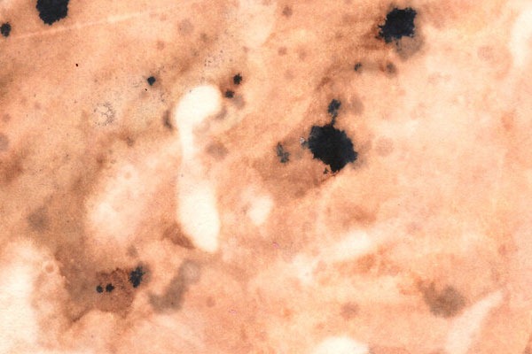
These are my hand-cut paper designs. My designs are not as intricate as the designs of Caroline Jane Harris and Aoyama Hina, but I wanted to practice with this techniques because I really liked it. Using the stencil I had created, I then created prints using inks and bleaches on firstly paper then tissue. The pieces were more of an extension of the previous experiments with ink and bleach I had created. Have a look http://ifeakinroyejegraphics.blogspot.co.uk/2012/05/ink-and-bleach.html

Creating a hand-cut paper piece.
I like the outcome of the work, but if I am to continue with this technique I would like to produce creating something a littler more finer like the paper artists I had discovered.