Pages

Tuesday, 7 February 2012

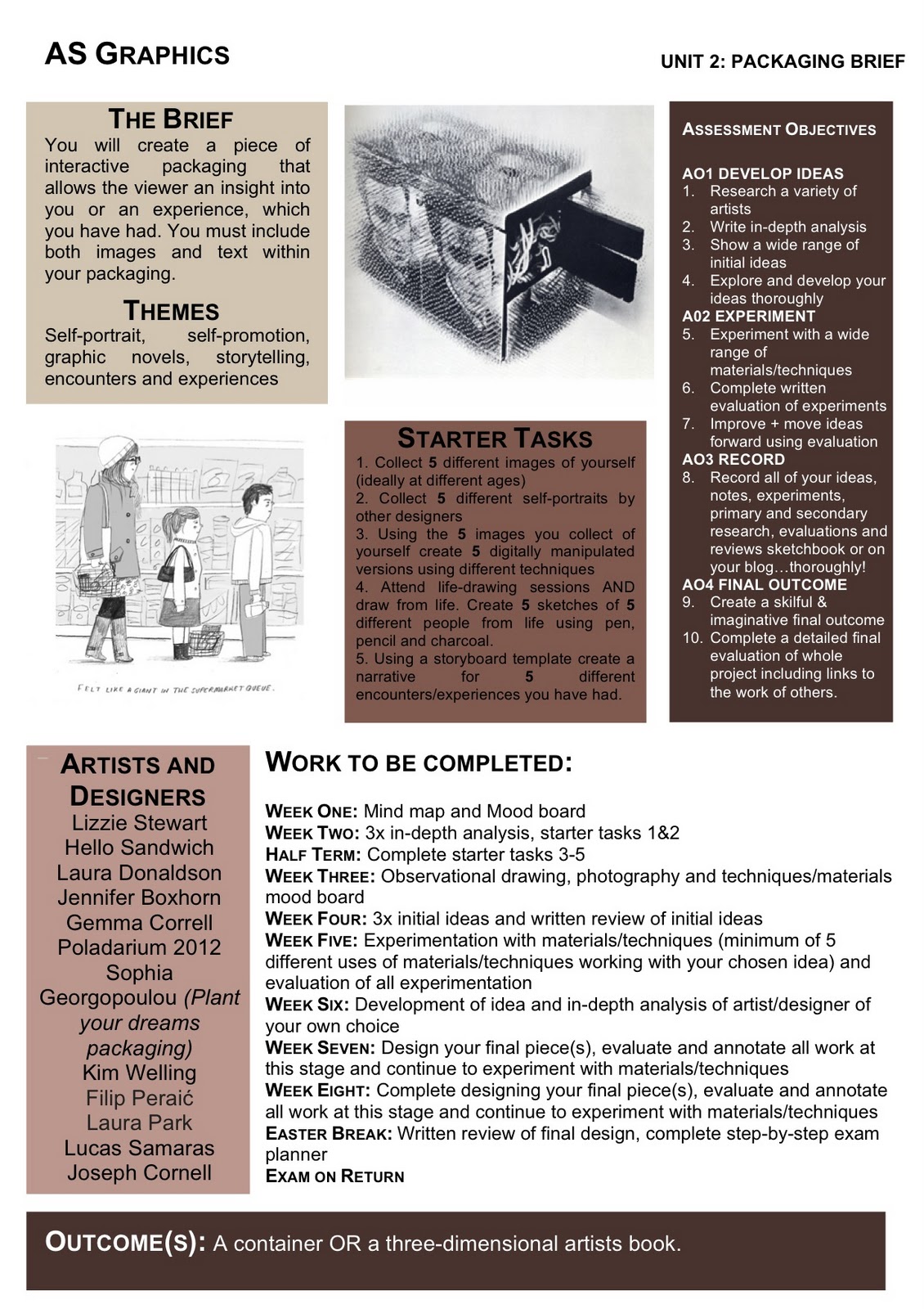
My Chosen Exam Brief: Packaging


https://blogger.googleusercontent.com/img/b/R29vZ2xl/AVvXsEhNzRI8u2JFPCD_Cc49yfBpxOA-e5TXwf8QtYf68L9rkSlFgg-eH8Uk2fU7PKwGkRFzhNQmEFuT3BtXxvdZoc6c1rG76GsdMimMSQK6CKMTmaT6zw19J_ZvjgpNzjYHg87MIQC43krgotQ/s1600/packaging.jpg

Above is the brief I have chosen to follow. My previous project focused on packaging, but I think this brief will allow me to create packaging, with is my personal, and self-promotional. I plan to look at photography artists, who focus on portraits, such as Preou, Terry Richardson and Piczo. I will also look at artists who create pop-up books, paper engineering and similar designs. Chrissie MacDonald who is an artists who does a particular style of work which I really like, so I will research more into her style. I will have to experiment with photography, pop-up designs, and drawing. I will practice with all of these to find what will work best for my desired outcome. I hope to create a 3D artist book, and explore pop-ups and portraiture in particular.

Below is the moodboard I have created for the brief.


Typography Brief


I like this brief, as I will be able to create typography which appeals to our senses. Emma King's typography work stand out, as it attracts the eyes. Anna Garforth's 'Edible Poster', attracts the taste sense, but it is still typography. Debbie Smyth, and Maricor/Maricar's pieces, appeal more to touch, as they use fabric to create some of their typography work. I really like how thread has been used and if I was to do this brief, I may look into knitting, and using thread to create typography. I really like the different methods used to create typography, but it is more interactive, and the public can experience the work.

Moodboard Below: