Pages

Sunday 22 January 2012

Graphics Retail Project: Final Packaging and Evaluation

Final Packaging and Evaluation


Above is an image of my final packaging design and below that is my swing tag and then my logo.


I decided to look more into the packaging as my shop being a fancy dress botique would have to target children as well as adults. I think have a fun and slightly childish piece of packaging can work effectively, as children would be attracted to it, and more older people are likely to perceive it as fun and playful. This idea of fun and play closely links to fancy dress, and dressing up, so have a piece of packaging which suits that is good. I am still keep the shape of the packaging, a cube which a separated top and bottom. I think making the shape simple, would allow me to make a more vibrant and creativesurface design, without making it too busy.

After, looking at different companies and shops, I decided I wanted to create a fancy dress boutique. I researched names and came up with ‘A Little Bit of Everything’, or ‘ALBOE’, this became the starting point of my project. I had to design a logo, packaging and a swing tag, and began with creating a logo. I researched the logos for different shops including clothes shops, boutiques and fancy dress shops, collecting my favourite logos, and taking a closer look into the logos for the ‘OBEY’ Giant clothing company and ‘Puma’, a sports clothing and footwear company. The work of designer Raja Sandhu stood out to me when I was researching logos. His logos are cool and skilful,

Looking at logos really highlighted how simplicity is quite often the most effective. After a series of trails and experiments I created a few logos for ALBOE. I think my hand-drawn logos worked better than the ones created on the computer such as the Neon logos, or the cross stitch logo. I made two logos because each can be used in different circumstances. Logo 2 can be used on the shop front, whilst logo 1 can be used on packaging or other items. I wanted my logos to stand out and be quite fun. I think I did achieve this, especially with logo 1 where most letters have a character if its own. Although, I think it would have been better if there were more characters, so each letter was a different little character. Logo 2 was inspired by the Toys ‘R’ Us logo. I like the company’s logo and the cartoon typeface it was done in. It was also useful to research into the Toys ‘R’ Us logo as the toy retailer is aimed at young children, so it proved helpful for me when experimenting on how to create a fun logo design. Although, my shop is not aimed only at young children, my shop is a fancy dress shop, and fancy dress does bring out the child in most adults. That is why I think a fun logo is better when trying to target my specific audience.

The ALBOE character was inspired by other company characters I discovered whilst researching. Companies such as Toys ‘R’ Us, McDonald’s, Monopoly, Chewits and KFC all have their own company mascots or characters which often appeared on packaging and in promotions and commercials. I saw having a company character as effective especially to a younger consumer, but equally as my fancy dress boutique is quite fun and playful, the older person is likely to like it as well. Researching into company characters helped me to decide that this ALBOE character was the best. I dressed this character in mismatched fancy dress clothes, so the relationship between the company and the character can be seen.

I then went on to researching packaging. I wanted a simple design although, Carlo Giovani’s packaging designs did really stand out to me as quite quirky and fun for young people. I made a simple box net with side parts (a top and a bottom), so it was able to open and close. I wanted something fairly simple, so I could make the surface design colourful and bold. I created a net in Adobe Illustrator, I made the net quite large, as it was a box for holding fancy dress items such as marks, crowns and clothes, and so it needed to be fairly big. I went on to research different surface designs. I really like Jess Giambroni’s surface designs on coffee cups. She sketched faces on the cups, which gave each face an individual character. I liked this and when on the sketching my own surface designs, as well as creating various other surface designs, such as collages, and design made from bubble wrap and bleached and dyed fabric. I scanned my surface design experiments into the computer which allowed me to further my experiments on Adobe Photoshop where I collaged and then edited my already hand-made designs. I think they worked well, and some then become the inside surface design of my packaging, and some other become the bottom side of the box outside surface design. Clark Goolsby’s ‘Vertical Hold’ inspired the final outcome of the surface design for the bottom side of the box. I really liked his piece and after experiments, I saw this design would suit my blog a lot. I edited the vertical stripe collage I created in Photoshop, and also used it for the trousers of the ALBOE character, as well as for the net design.

For the top side of the box I was inspired by the McDonald’s ‘Happy Meal’ box, where children are able to cut out card items from the box and play with them. I decided to make a dressing up game on the box, where users can cut out clothing items belonging to the ALBOE character and dress it up. I thought this would be appropriate to the shop theme, as it is a fancy dress shop. It also enhances the idea of fun through the packaging. I created the ALBOE clothes and designed them using Adobe Photoshop and Illustrator. I made each garment different from another, and gave the users choice by creating more than one type of item. I also incorporated some of my hand-made designs into the clothing, an example is that one of the trousers have my collages in them, which I had edited using live trace, then merged together with the trousers. I think the box surface design would have been better if it was already cut, and users only needed to pop it out, such as the McDonald’s ‘Happy Meal’ designs. I think if there was a way clothing was interchangeable once it was already on the ALBOE character, it would have been better. This would have allowed users to change the clothes of the character and use it over a longer period of time. With more time, I would go on to trail different ways of making the clothes inter-chargeable and creating a pop-out design. Despite this I think the packaging outcome was a success. This was an effective design as it was able to target my desire consumer of both children and older people who wanted to have a bit of fun.

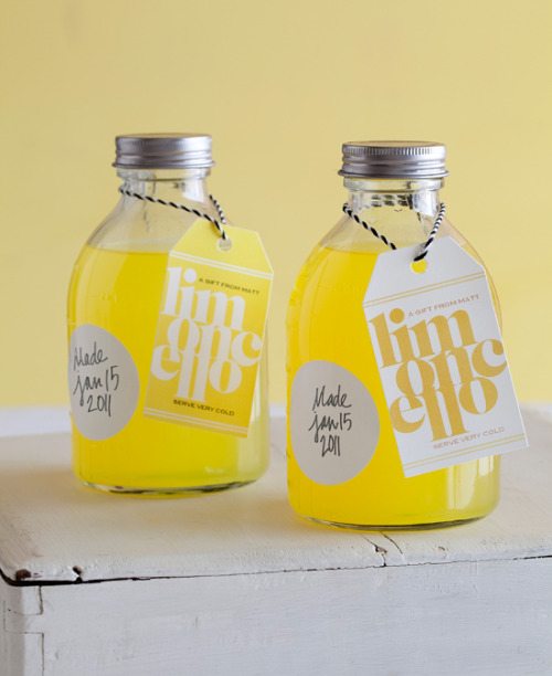
My final net design was quite simple, and I wanted it to be this way. After researching how other swing tags look, I saw having a simple surface design for the swing tag is best. I liked the oval shape, so decided to use this and then a blue background colour, boarder with red so it can appeal to any gender or age. The swing tag has been done in two parts, because the ALBOE character is detachable, so that users can take it apart from the information swing tag and use it to dress up with the clothes attached to the box. I like this idea of a two part swing tag, offering users something different. The design of the swing tag is fairly simple because through research I saw swing tags are often quite simple. The swing tag has the main ALBOE logo on the back, then the cartoon logo I created on the front. I wanted to write ALBOE in various ways so is looking more appealing and less repetitive. I think this is an effective logo, because it gives the information needed including the instructions on how to use the ABLOE character, and the clothes attached to the box. The ALBOE character is also present on the swing tag, so it becomes a recognisable character for users.

Overall this was a successful project, as I was able to meet the brief of creating a shop idea, logo, swing tag and packaging. I aimed for the items I created to target an audience of both children, but also adults. I believe fancy dress brings out the child within someone; so having a fun and more childish design can appeal to both adults and children. I wanted the packaging and logo to look playful, and I think I achieved this. Although, with more time I would allow for the clothes on the box, to be more easily detachable, I think the idea was good.

Graphics Retail Project: Final Swing Tag Design

Final Swing Tag Design


Front


Back


This is my final swing tag design. It is in two parts, because the ALBOE character is detachable, so that users can take it apart from the information swing tag and use it to dress up with the clothes attached to the box. I like this idea of a two part swing tag, offering users something different. The design of the swing tag is fairly simple because through research I saw swing tags are often quite simple. The swing tag has the main ALBOE logo on the back, then the cartoon logo I created on the front. I wanted to write ALBOE in various ways so is looking more appealing and less repetitive. I think this is an effective logo, because it gives the information needed including the instructions on how to use the ABLOE character, and the clothes attached to the box. The ALBOE character is also present on the swing tag, so it becomes a recognisable character for users.

Saturday 21 January 2012

Graphics Retail Project: Swing Tag Experiments


Swing Tag Experiments

Hand Drawn initial ideas for a swing tag


Initial ideas for the shape of the swing tag. Adobe Illustrator used to create this.


These are my swing tag experiments. I done this so I could gain a better understanding of what swings would work best. I like the experiments, and having the ALBOE character somewhere within the log works really well. Experiments, trying to find designs which work best for my swing tag. I tired to make them quite simple, because after looking at other swing tag designs, i saw simplicity as quite important.

Graphics Retail Project: Swing Tag Research

Swing Tag Research
Hand-Made Swing Tags


favorcraver:  Homemade limoncello with slick DIY labels. Check out the details on the label making project at Matt Bites.  Love these! Maybe cause they’re such an awesome bright yellow….


This is a swing tag produced by Matt Bites, for homemade limoncello. I liked this design because of the use of vibrant colours. The limoncello is a bright yellow, so the swing tag incorporates yellow colour into the swing tag, but not too much so it blends in with the product. The swing tag has been designed, so it is not too busy. I like this minimalist style, I think it is effective because it allows consumers to focus is on the text on the label. The large text on the label is the name of the drink, having it written large and stylistically such as this appears like it will appeal to elder people, possibly a more adult market.

Graphics Retail Project: Swing Tag Research

Swing Tag Research


The work entitled 'Peace, Love and Reindeer Hugs', shows how a successful logo, looks like. The surface designs of these swing tags are bright and colourful, whilst the tartan pattern on the swing tag can often be related to winter, although it has not been created in winter colours the patterns suggests winter. The use of the cartoon reindeer relates to the name, "..reindeer hugs". The designs is fun, with the use of swirly typography, a cartoon and a lightly coloured tartan pattern. The basic shape of the swing tag allows for a colourful surface which out it looking too busy. I will when creating my swing tag have to consider carefully shape and surface design, to ensure it does not look to busy.


Graphics Retail Project: Swing Tag Research

Swing Tag Research


Brand tag hang tag swing tickets garment tags swing tags


This is a swing tag design I came across. It is an unique shape, and the design looks quite feminine. This is likely to be a swing tag for a female product because of the type of style it is done in. The floral type swirls used as a type of boarder of the swing tag, look pretty, and almost quite delicate, which could be aimed at more women than a male consumer. Brown colours are used for the swing tag, making it minimal, and not too bright. This swing tag works well, because their is not too much going on. Its a simple pattern, which necessary information put on the black and white sheet attached to the swing tag.

Graphics Retail Project: Swing Tag Research - Ashley Potter

Swing Tag Research


Ashley Potter


http://www.free-range.org.uk/images/images/46040.jpg


These are swing tags created by Ashley Potter, an Illustration graduate from Plymouth University. I like these swing tags because they are simple in shape and colour, but the text gets the message across. I like the use of patterns on the swing tag, and the contrast of light blue, green, pink and grey text upon a brown background. I like how the background design, does not distract from the information trying to be given. I think the swing tag looks quite natural, and has an environmentally friendly feel about it. This is just one example of how a swing tag, can suggest a theme or idea. This logo for example looks like it is aimed at an older woman (18+) because the design is quite feminine. The colours used are quite light, which also suggest that the targeted consumers are women. I think this would better suit an adult woman, because the design is quite formal, and appears to be for a product that adults would buy. The brown card as the base, links to this idea of being green, ad highlights how he looks of a swing tag can translate to others what the shop is about.

I hope to create a swing tag for my fancy dress boutique. Looking at this will help me further my swing tag ideas.


Graphics Retail Project: Final Top Side Surface Designed Net

Final Top Side Surface Designed Net


These are my final top side of the box surface designs. The net is in parts, because the whole net is too large to fit on one side of paper. I wanted to have a large net because for a fancy dress boutique, the box would be used for items such as masks which are often quite delicate and costumes which are often bulky. Upon the net are clothes, which are created for the user to cut out and dress up the ALBOE character.


After various trails I assembled the box. The image above is a prototype, made from paper. It is quite flimsy, but it allowed me to see how the final design will look once made, and what changes I may need to do to the net and surface design to make it better. What I noticed when creating the prototype is that one of the net sides was up-side down, so I had to go back to Adobe Illustrator and turn it around, so it was the right way round.

Graphics Retail Project: Final Bottom Side Surface Designed Net

Final Bottom Side Surface Designed Net


Image 1


Image 2


Image 3


Image 4


These are my final bottom side surface designs for the nets I have created. I collaged hand-made designs I previously created, and then edited in Adobe Photoshop. I also changed the colour gradient of the images, and assembled them to fit into the net. I also added the ALBOE character to the design, so a connection between the company and the packaging can be made.

Image 1 is the first surface design I created, but the net I made was too short in length.

Image 2 is my second trail of the bottom side of the box surface design.

Image 3 is the net from 'image 2' an assembled together. Once I assembled it, is when I noticed that I did not add enough tabs to the net.

Image 4 is a net with extra tab added to it.


After various trails, I have now a completed net. It was complicated getting the measurements, and overall net correct, but the outcome is quite a success.

Graphics Retail Project: Creating Clothes for ALBOE Character

Creating Clothes for ALBOE Character

After looking at the McDonald's 'Happy Meal' packaging, I decided I wanted to trail and experiment with the 'cutting out pieces' type game. My packaging will allow buyers to cut out items of clothing for the company character to wear. My packaging is a basic two part open top box, but I hope for the surface design to be full of design.


ALBOE clothes taken apart using Adobe Photoshop.


Here I edited the trousers of my character using a previously created collage. I used different 'Live Trace' tools on Adobe Illustrator, to create different effects on the collage.

Although it might just look like a weird shape, this is the top for the character ALBOE. I previously created some patterns on paper, so scanned them in and then edited it using Adobe Photoshop. I then went on the experimenting with Live Trace on Adobe Illustrator. It looks a little untidy, but I think once put onto the character it would look a little better.


The character I previously drew and edited in Adobe Illustrator is now the company character (see previous posts), and this box will allow people to play around with dressing it up. I thought this would be a good idea because my idea is a fancy dress boutique, so having a dressing up game on the packaging is relevant to the shop idea. This will not only be a game for the children. The box is for holding costumes and outfits they purchase from the fancy dress boutique, so both adult and children customers will use this box.


(The designed pieces of clothing put onto the ALBOE character logo)


My fancy dress boutique is also not solely aimed at only a children market, I believe many adults will purchase costumes from the shop for themselves and others. These adults may be interested in something fun and this packaging will hopefully offer that plus it is something creative and playful. When thinking of fancy dress it is usually associated with playtime, or childish behaviors. Having a box such as I plan will hopefully bring out the child within in the adult buyer, as fancy often does the same.


These images show how I have progressed after creating the ALBOE Character. I will now go out to designing each of the outfits, to make them more exciting.

Graphics Retail Project: McDonalds Happy Meal Packaging

McDonald's Happy Meal Packaging


Image 1


Image 2


Although, I am not doing a fast-food store or shop that sells food, I thought the 'Happy Meal' box is a very effective example of packaging. The 'Happy Meal' box which is used in fast-food restaurant chain McDonald's, is for the children's meal they serve at the restaurant. The 'Happy Meal' started in 1979, specifically targeted at a children market, thus the food size is smaller the packaging is usually bright and very colourful as it is targeted at young children who would eat the meal.

1999 McDonald's Happy Meal Box (Pluto Europe)


1999 McDonald's Happy Meal Box (Pluto Europe)

Image 3


1999 McDonald's Happy Meal Box (Goofy North America)

1999 McDonald's Happy Meal Box (Goofy North America)

Image 4


The McDonald's 'Happy Meal' package also often have cut out pieces in them, which gives the buyers something to play with and amuse themselves, (see above images). The handle of the box is a yellow letter 'M' relating to the logo of the restaurant. Making a clear relationship between the packaging and the company. I think ensuring the packaging is recognisable as part of a certain company is important so people can recognise the brand.


Image 5


Often the surface design of the McDonald's 'Happy Meal' is of cartoons characters, characters from films, books or fun animated characters created by the McDonald's company. Children are able to play games on the box and enjoy being able to colour a picture, complete a maze or just solve a few puzzles. I like that the packaging is able to be as fun as the product inside it, and that is why I believe this is an effective piece of packaging.


1999 McDonald's Happy Meal Box (Chip 'n' Dale Africa)

1999 McDonald's Happy Meal Box (Chip 'n' Dale Africa)

Image 6


Children are able to cut out tokens and characters to keep. I think it is a good idea to make the packaging fun, as it represents the product as quite enjoyable. The McDonald's 'Happy Meal' offers a meal, a plastic toy figure, but also a shaped box to entertain someone whilst they consume the contents of the box. Overall it allows the child to have an exciting fast-food experience, and also be able to see what they have completed at the end of the meal.

After seeing the McDonald's boxes I think I will trail with creating my own box with a fun surface design.


Graphics Retail Project: More Surface Design Experiments

Surface Design in Net


These are collages of previously hand-drawn designs which I edited using Adobe Photoshop. I used the gradient tool to experiment with different colours. I like the different colours, and the way this has come out. I think this will look better for the surface of the inside of the box, and then I do further experiments for the outside of the box.

Graphics Retail Project: Development of Surface Design in Net

Development of Surface Design in Net


I scanned in the surface designs I previously created, then edited them using Adobe Photoshop. I collaged my previous hand-drawn designs, and then I used different gradient colours, fill and effects, to try and experiment with different surface designs. I like how I could incorporate some of my hand made designs into surface designs, and I think it worked quite well. I added the ALBOE character logo, so there is a relationship between the product and the shop, but I think it may look a little out of place. To further my experiments, I went on to using more colours trying to find what colours would best suit the type of people who would shop at my fancy dress boutique.

Graphics Retail Project: Net Surface Designs

Net Surface Designs


Below are my next surface designs. I hand created each of them then made it into a box. Under each different design is a little description of the medium I used, and whether or not I believe it is successful. Under some it make state my influence of this design, and some designs were influence my the work of other artists. There are some which I think worked really well, and I am likely to go on and make this into a surface design for my packaging.


Vertical Collaging

[Vertical+Hold+paper+collage+on+canvas.jpg]

The designs below was inspired by artist Clark Goolsby. He does a lot of collaging work and I really like it because it is quite unusual. Goolsby created a piece entitled, 'Vertical Hold', which inspired my surface design below. I cut vertical stripes out of a magazine, then laid them like how I did below. I like this design, because it gave a collage effect, but it is quite organised. The bright colours, relate to the fancy dress boutique, because it is a fun themed shop.


Collaging
For the pattern below I cut out images and letters from a newspaper, then stuck them onto the net of the box. I like collaging and think the design works well, for the fun themed fancy dress boutique. If I continue with collaging, I would need to take my own photographs, so I can ensure images are relevant to my shop.


Drawing
For the pattern below I used black ink pen, to do various sketches on the surface deisng. I drew a range of little picutres images, as I wanted it to be random. I like the little drawings, but I am not sure whether all of them are suited for the fun theme of the fancy dress boutique.


Typography
For the pattern below I cut out a range of sentences, letters and words of different sizes, typefaces and fonts. I used newspaper designs, because I like the effective it creates. With more newspaper cut out designs on the surface area, I think it would look better, because at the moment it is rather empty.


Mixed Material

For the pattern below I got a range of material and put them together. A piece of card, sheet of patterned tissues paper, bubble wrap and cloth which I bleached and painted, make up this surface design. I like this because this allows consumers to touch, as well as see, bringing in another one of our five senses. The different textures, makes each side of the box individual.


Drawing Faces
For the pattern below I cut faces out of a newspaper, and used fine liner pen to draw clothes, and accessories on them. I did this, because my shop is a fancy dress shop, if the surface design of the box is fun and quirky then it could work better with the theme of the shop. If I was to further experiments I would photograph my own subjects, and draw different costumes on each of them.