Pages

Friday 20 January 2012

Graphics Retail Project - BentWorld - CANS


BentWorld: CANS


I think when creating packaging being creative makes the piece stand out, so after creating some basic shapes from nets, I began researching packaging which stands out. I came across these spray cans produced by Kidrobot. These appear in BentWorld: Vandals Series. I really like these because they really stand out. I like how the creator has used characters and developed them into packaging. This makes the work individual and distinctive. The range of colours also gives the buyer options, adding a little extra to the packaging. This is something I will take out when creating my packaging, doing a little extra so the buyer has options.


Source of images: http://www.behance.net/gallery/BentWorld-CANS-Artist-Series/2486845

Graphics Retail Project: Making 3D Shapes


From Nets to Shapes


I used previously created shape nets to experiment creating different shapes. Shapes included a cylinder, cube, and cone. This helped me to try out different packaging designs and what might suit my particular product and shop best. The shapes I created are quite messy, with masking tape parts on show, but it helped me see what shapes are easier to make than others. I also know for the final packaging it would need to be a lot neater.

Graphics Retail Project: ALBOE Character

ALBOE Character


After doing trails for a logo, I created this little character. For now it is nameless, but after researching other companies such as McDonald's and Toys 'R' Us, I saw this little doodle can became a mascot for my fancy dress boutique. Many brand mascots are highly successful, effectively targeting the chosen audience. I done varies little sketches of different brand characters, and I think this was the most appropriate for the company, and the most effective.

I scanned copy of the doodle I previously done then used Adobe Illustrator to live trace. I like this character and I think it represents my fancy dress boutique well. I Incorporated the 'A Little Bit Of Everything' abbreviation 'ALBOE' into the lunchbox of the character, so it is distinctive. This character can appear on products, and as a type of mascot for the shop. The character wears fancy dress showing the relationship between the shop and the mascot. I think this is quite distinctive, and stands out a a character for a fancy dress shop.


I also done the character in a range of colours, and incorporated some hand-drawn designs into the clothes of the second and fifth ALBOE character. I think I would change the colour the character and the clothes depending on the background. This way the character can fit into many different designs. And can change outfit according to occasion or seasons, for example green and red for the Christmas period, or black and orange for Halloween.

Graphics Retail Project: Mascots for Retailers

Mascots for Retailers


A Few Recognisable Characters


KFC

File:KFC logo.svgIn 1930 Harland David "Colonel" Sanders created fast-food restaurant chain 'Kentucky Fried Chicken' now more widely known as KFC. The founder of the restaurant still remains an iconic figure, and his image (look above) appears in KFC advertisements, campaigns and usually near the the brand's logo. Whilst only using the colours, red, white and black which appear in many logo designs (for example street clothing brand OBEY), this character is distinctive. Many brands create a mascot with a smiling face, such as this to convey a feeling of happiness and joy in the product. It also helps to give off a positive feel, and can be used to target perspective buyers.
Image source: http://www.kfc.com/


Haribo

Haribo is one of the largest confectionery producers in the world. Started in the 1920s, Hans Riegel Sr. began producing confectionery. Now the company is known globally with factories across the world. And the Haribo Kid is a cartoon representative for the company. The character dress in red, holds the Haribo logo as a sign in it's arm, highlighting the company it represents. It is also a young boy, which relates to some of the company slogans. The English slogan for the company is 'Kids and grown-ups love it so – the happy world of Haribo', having a young child as on of the company mascots emphasis the brand's slogan, of 'kids' and a 'happy world'. A lot of mascot a quite positive and red coloured clothes and smile help to transfer this through the image. I think this is a successful logo, and shows how it is good for a logo or company mascot to relate to the message you are trying to put across. The Haribo brand has done this well.
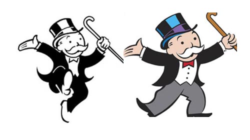
Image source: http://www.hippyshopper.com


(Other very recognisable company characters include the mascots for Pringles, Milky Way kid, Coco Pops monkey and Tony the Tiger for Frosties cereal.)

Graphics Retail Project: Mascots for Retailers - Monopoly Mascot


Mascots for Retailers


Monopoly Mascot


The Mascot for the Monopoly board game is Rich "Uncle" Pennybags, but many people just know him as the character Mr. Monopoly. The character is dressed appropriately to its name. Wearing a black top hat and a suit. This makes it easier when people are looking at the character to remember it's name. The clothes in which it wears unlike some other company mascots, are not brightly coloured. Which gives a feeling this game is not only for children. As this is a family game, it is quite appropriate that the character targets the whole family regardless of gender or age. So the simple and more realistic colours of the outfits worn by Rich "Uncle" Pennybags reaches out to that broad audience.


http://photoshopcandy.com/wp-content/uploads/2010/02/monopoly-mascot.jpg


In many pictures where I have seen this character it poses in a jump or more energetic pose. This suggests that the game is exciting, and fun. Again reaching out to an audience who want to play a game and have fun. I think this logo works well, and it is recognisable for the public.


Graphics Retail Project: Mascots for Retailers - Green Giant


Mascots for Retailers


Green Giant


Image 1


Image 2


The Green Giant character was introduced in 1928, for the canned vegetable company, Green Giant formerly known as Le Sueur. The company is best known for it's corn and green peas, so the character is large and green. Making a relationship between colour and products is important and I think making the giant green not only fits the name of the company, "Green Giant", but also the peas which it's best know for manufacturing. Although, the character is a giant, through facial expressions the character looks friendly and welcoming. The character also suggests the company's produce is wholesome and makes eaters stronger, because of its stature. The Green Giant character shows how the quality of what is being sold, can be suggested with a company mascot.


Image sources: 1. Green giant can ; 2. Green Giant Poster

Graphics Retail Project: Mascots for Retailers - Ronald McDonald


Mascots for Retailers


Ronald McDonald


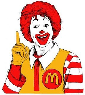
Ronald McDonald is the mascot or character for the global fast-food restaurant chain McDonald's. In America 1967 Ronald McDonald was created and became a trademark of McDonald's. Ronald McDonald's appears in many of the fast-food chain's television commercials, and very distinctive.


Ronald McDonald is a clown character targeted at children who eat at the restaurant. Above are some images by the McDonald's co-operation. The images show the old and the new Ronald McDonald's and show how the character has changed over time. The character is fun and often in television advertisements he goes on adventures, which captures the imagination of the children. The clown style outfit given to the character makes the character more rememberable. Dressed in the McDonald's distinctive colours; red and white, Ronald McDonald wears a red and white stripy top, yellow overalls, a big red wig and clown painted face, which makes the character stand out. Using colours which are associated with the company, in this case red and yellow, is very good for the public so they can associate the character with the brand.


Ronald McDonald looks fun and happy, which targets the young audience. I think this character really works well with the brand, as even when Ronald McDonald is not near a McDonald's shop or logo, people are able to link the relationship between Ronald McDonald and the McDonald's restaurants. The use of the McDonald's logo on Ronald McDonald's outfit is also very useful, for the public so they are able to see what this character is.


Graphics Retail Project: Mascots for Retailers - Chewits


Mascots for Retailers


Chewits


This is Chewie the Chewitsaurus, the official character for the Sweet company 'Chewits'. The dinosaur, represents the company in many of their campaigns and adverts. Meaning frequently the character undergoes some change, as seen above. The middle image is of the dinosaur after 2009. Prior to this Chewie the Chewitsaurus looked more hand-drawn cartoon like. I think Chewie the Chewitsaurus gets the attention of young buyers because it looks fun and happy.


Having a bright and fun character can really make a product stand out, and attract the right people. The dinosaur is brightly coloured green, but I think the big smile on the reptiles face, is what makes it playful. It suggests a happiness, and an idea of fun.


Chewits are manufactured by Leaf International and images can be found on their website, http://www.leaf.eu/

Graphics Retail Project: Toys 'R' Us Logo

Toys 'R' Us Logo


Above is the Children toys and product retailer, Toy 'R' Us' logo. Toy 'R' Us was founded in 1948, and is a very well known company, having many stores across the world. The Toy 'R' Us logo is effective because it relates well with what the company are selling. The logo is bright and colourful using a range of childlike colours to fill comic style font. This means the logo can successfully target it's audience of children because they are likely to be attracted to the brightness and fun within the logo.


This is the mascot for Toy 'R' Us called Geoffrey the Giraffe formerly known as Dr. G. Raffe. This character was created during the 50s as a representative of the company which appeared in most of the company's adverts and campaigns. This is successful because it uses a likable animal, to create something to target their young audience. The bright orange colour of the animal and the star patterns make the character fun.


Both the logo and mascot for Toy 'R' Us are effective and relate to the products which the shops sells. I think having a character really works well, as it is able to further represent the company, and give the public a cartoon figure to relate to the company.


Graphics Retail Project: A Little Bit Of Everything Logo Design

A Little Bit Of Everything Logo Design


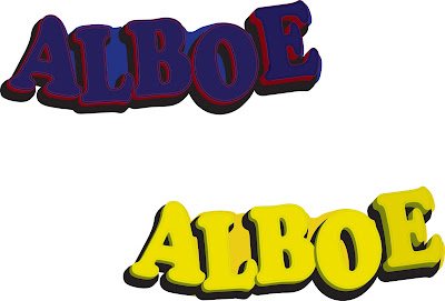
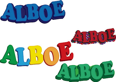
Above is my 'All Little Bit Of Everything' doodle, edited using Adobe Illustrator. I used different effects and tools to enhance the image. I think the 3D effect worked really well with the logo, as it makes it stand out. The boldness of it enhances the characters on the letters and the actual lettering itself. Although, I like the outcome of some of these trails some are a little messy and using Adobe Photoshop to neater up some of the lines, would make it better. I think this logo is great for the Fancy Dress Boutique. Inspired by artist


I created little fancy dress outfits for some of the letters, making them to individual characters. I think this is appropriate for the type of shop because it is playful and targets children, but also older fancy dress wearers who are likely to be fun, and attracted to this kind of sign. I will continue to trail with different logos, but I do think this works well.

Graphics Retail Project: ALBOE Logo Design Experiments

ALBOE Logo Design Experiments


Progression of creating the 3D logo design in Adobe Illustrator.


I thought I would experiment with more logo designs. I used Adobe Illustrator to create this 3D cartoon effect. I think the letters look quite playful and stand out. Fancy dress and costume shops are quite playful and fun, so the letter does go quite well. I think it is bold and stands out. If I continue to using this design, I would need to neaten it up a little first.
Graphics Retail Project: A Little Bit Of Everything Logo Experiments

A Little Bit Of Everything Logo Experiments


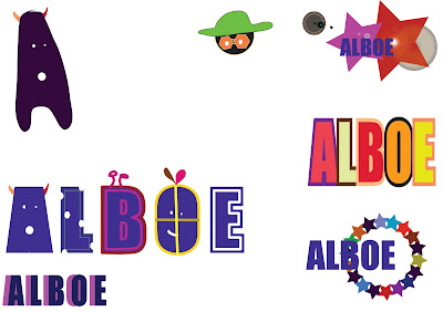
These are just a few doodles, of experimental logos. I think the little character in the bottom left hand-side corner could work well as a character logo with development. The text in the center reading 'A Little Bit Of Everything' also I think has the potential to be a better logo design.

Graphics Retail Project: Initial logo design ideas - doodles


Initial logo design ideas -
Drawing Out Ideas


These are hand-drawn designs of possible logos. I am experimenting with a range of designs, and trying to create something quite different from other logos. This is helping to find out what type of logo works better for my fancy dress boutique, and what kind of logos are not that effective for my type of shop.

Graphics Retail Project: Initial logo design ideas - oli pastels


Initial logo design ideas -

Oil Pastels


I used green and blue oil pastels to create this effect. I used my figures to blend colours, and create a thick outline for the letters 'A' and 'L'. I like this techniques because of the merging or colours, it looks smooth and with development I think it could look quite good. However, I do not think this technique is very suiting to a fancy dress boutique.

Graphics Retail Project: Initial logo design ideas - paint


Initial logo design ideas - Paint


Here are the logo I created using paint. I utilised different techniques such as splatting the paint, rubbing, and finely brushing, this was to practice with a range of techniques allowing me to see what may suit my fancy dress boutique best. I like the finely painted ALBOE design, although I am not sure whether it relates to my shop type I think it looks nice.

Graphics Retail Project: Initial logo design ideas illustrator

Initial Logo Design Ideas Illustrator


These are my initial logo design experiments. I used Adobe Illustrator to create these, experimenting with different tools to give various effects. I like how these have turned out, but I am not sure if the designs are all really suited to a fancy dress boutique, so look too formal, or they quite boring for a costume shop which would be quite quirky and fun.

Graphics Retail Project: Cross Stitch experiment 2

More images from my cross stitch experiment.


Graphics Retail Project: Cross Stitch experiment

Cross Stitch experiment


Cross stitching is 'X' shaped stitched put together to create a pattern. Above is an example of a fairly simple looking cross stitch letter found on http://pixelsinthewild.tumblr.com/. Cross stitching is a very popular method of weaving, and when done by hand can sometimes take many days to create.


I wanted to experiment with the cross-stitching technique, but to create a logo design. Above are my cross-stitch experiments created in Adobe Illustrator. I used the repetitive 'X' shape to create the letter 'A' as it is the first letter in 'ALBOE' my shop name. I then went on to filling and outlining the 'X' shape, to create the pattern which makes up the letter 'A'. Although, I like how the outcome of this experiment, I think I will conduct further experiments, to find out a different way to create my logo. This I believe would not be that effective for my type of shop (a fancy dress boutique).