Pages

Monday 27 February 2012

Photographer and Artist

David Shrigley

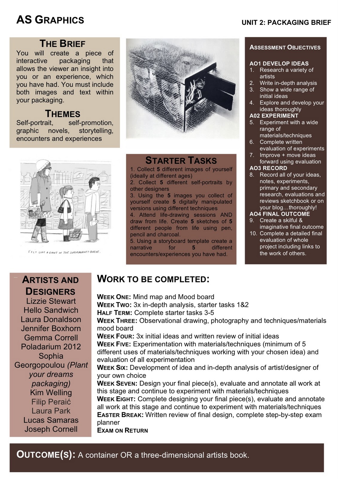
Although the above is not a portrait of a person, I do believe it is a portrait of an object. This is the work of David Shrigley a British artist who works with a range of mediums to present his different animation, paintings, photography, sculptures and drawings. The piece created in 2002 is entitled ‘Hot Dog’, and shows a hot dog laid on the bed under the covers. The photography quality appears quite low and may have been done with a film camera giving it a graining effect, which adds a sort of gritty atmosphere. The resolution of the image is low, and vibrant colouring has not been added to the photograph. It does add a more natural effect, and could have been done to make the image although unrealistic appear similar to a human if in the same situation.


The photograph is quite small only 400 x 300mm. Taking up most of the image is the bed and the floor, with the small hot dog character upon the bed. Using lightly coloured fabric for the bed sheets allows for the hot dog to stand out because of its brown colour, and therefore will stand out against the white.


The image is quite surreal, and Shrigley has personified the hot dog putting it in human situations. Little googly eyes have been put on to the hot dog, giving it facial features, this add humour to the photograph and I thin kit works well. The work of David Shrigley is often humorous, and quirky.


I really like his style of work in particular his illustrations and photography. Shrigley’s work is quite individual and stands out. I like how Shrigley mixes humour and art, and it works well. I think Shrigley will influence my work, because when looking at ‘Encounters, Experiences and Meetings’ the theme of the exam, Shrigley’s work is often focusing on subjects relating to the theme. I will also look further into his illustration work, because I like the style of his work. Below are more examples of Shrigley's photography work.


Wednesday 8 February 2012

Protrait Photographer

- Piczo
Piczo is a Japanese photographer based in London, who has worked for publications including i-D magazine, Cheap Monday and Indie magazine. I like Piczo’s work because he really known how to capture the youthfulness of his subjects.


This is Piczo’s latest commission for Reebok. This is fashion photography, and the image above I think the use of props makes the photography more interesting, and brings character to the images. The outfits that the models wear are basic coloured in grey and black, so the use of props makes the photograph more fun. Reebok would have been the providers of the outfits, so the photo shoot is sportswear based.

The shoot is likely to be done in a studio, as background is one flat colour. The grey coloured screen works well, because then the focus is then put to the models and what they are wearing. In this particular photo shoot it is important that the brand is centralised; as it is advertising the sports brand Reebok’s collection.

Piczo has put the models in the centre of the portrait, allowing for only grey space to surround them. The contrast of the foreground and background, works well to highlight clearly what is being advertised.

Although, the subjects in the image are quite straight faced, the photograph is quite energetic. The models stand fairly straight, looking almost directly into the camera lens; I think the seriousness in their faces helps so that a characteristic expression is put through photograph. Again attention is not taken off the sportswear.

I like this piece because even without the use of bright colours the piece it quite vibrant and bold. The work is skilful, and stand out to many other portrait photographs I have seen before. I like how the photography is not too serious and how different props for the models, which make it more fun, and bring character to the photography.

Below are more examples of Piczo's work.


All Photographs from: http://www.piczoweb.net/

Tuesday 7 February 2012

My Chosen Exam Brief: Packaging


https://blogger.googleusercontent.com/img/b/R29vZ2xl/AVvXsEhNzRI8u2JFPCD_Cc49yfBpxOA-e5TXwf8QtYf68L9rkSlFgg-eH8Uk2fU7PKwGkRFzhNQmEFuT3BtXxvdZoc6c1rG76GsdMimMSQK6CKMTmaT6zw19J_ZvjgpNzjYHg87MIQC43krgotQ/s1600/packaging.jpg

Above is the brief I have chosen to follow. My previous project focused on packaging, but I think this brief will allow me to create packaging, with is my personal, and self-promotional. I plan to look at photography artists, who focus on portraits, such as Preou, Terry Richardson and Piczo. I will also look at artists who create pop-up books, paper engineering and similar designs. Chrissie MacDonald who is an artists who does a particular style of work which I really like, so I will research more into her style. I will have to experiment with photography, pop-up designs, and drawing. I will practice with all of these to find what will work best for my desired outcome. I hope to create a 3D artist book, and explore pop-ups and portraiture in particular.

Below is the moodboard I have created for the brief.


Typography Brief


I like this brief, as I will be able to create typography which appeals to our senses. Emma King's typography work stand out, as it attracts the eyes. Anna Garforth's 'Edible Poster', attracts the taste sense, but it is still typography. Debbie Smyth, and Maricor/Maricar's pieces, appeal more to touch, as they use fabric to create some of their typography work. I really like how thread has been used and if I was to do this brief, I may look into knitting, and using thread to create typography. I really like the different methods used to create typography, but it is more interactive, and the public can experience the work.

Moodboard Below:


Saturday 4 February 2012

Illustrated Guide Brief

https://blogger.googleusercontent.com/img/b/R29vZ2xl/AVvXsEgEwDoFjHMrLjKhS6taGShUPaM2B8RoFDSEOjtw0vsOne76pQ98gkjN_zpem5LChyAepavUvhY6sG-PaOAT3PQvu26gc0gfeB33lboAK136CLTKXDJtAbrzA9f9dj5wjChH-eP-MCaGoS8/s1600/illustration.jpg


With this brief, I would look deeper into perhaps painting, mono-printing or drawing. I really like the effected created by mono-print and water colours, so researching this and experiementing will help my technique. I would look at artists like Hennie Haworth and David Ryan Robison, because I like their style of work. Below is a moodboard I created for this brief.


Olympics Brief


https://blogger.googleusercontent.com/img/b/R29vZ2xl/AVvXsEg_o2wOhFQ1_H6ovmb7mvrlH8jyRiS_RyOKK0LEu_k2O2H6gmJdNdJ_uVjmFxrN4maknNtiUlRI-i504uaLFSVWOkKViK8wccAnysGTgyxYw8yoww5MN_CCEFicxCYC1VFpS5E1NhMwcec/s1600/+Olympics.jpg
Olympics Brief


This is my new exam project. The exam project is themed: Experiences, meetings and
Above is the Olympics brief. If I decide to do this one, I would like to concentrate on making a poster and t-shirt. I would keep the existing logo, and try and edit it to fit the event I will choose. I would like to focus on creating a poster or t-shirt for events such as gymnastics or hurdling, because I think those will create the best images. Below is the mood-board for the Olympics briefs.


Exam Project


This is a spider diagram I created for the new exam project, which is themed; meetings, experiences and encounters. The different briefs I have been given are 'City Guide Illustration', 'Typography', 'Olympics Advertising' and 'Packaging'.