The work of Katy Lemay stands out to me because of the mix media techniques used within the piece. I then went on to look at the works of Michelle Tompson, and really liked this work also. I like the use of photography, typography and different techniques used. I think this is a good way to present imagery, and take a photography one step further. David Fullarton is another artist who uses this mix media combination to create a textured image that stand out.
Katy developed an overwhelming passion for illustration while completing her Bachelor of Graphic Design at the University of Quebec in Montreal. It was also during that time that Katy created her unique style
Katy Lemay
 Katy developed an overwhelming passion for illustration while completing her Bachelor of Graphic Design at the University of Quebec in Montreal. It was also during that time that Katy created her unique style.vvvv
Katy Lemay's work is really great because of the playful combination of photography and illustrations. The use of children in the pieces reminds of a children's book, and the bright colours used look like it appeals to children as well. I like the use of black and white photography upon the colourful drawings and painting.
Katy developed an overwhelming passion for illustration while completing her Bachelor of Graphic Design at the University of Quebec in Montreal. It was also during that time that Katy created her unique style.
Source: http://www.agoodson.com/katy-lemay/
Michelle Tompson
Michelle Thompson is an illustrator, but also creates a range of mixed media pieces which combine photography, books, scraps and other materials. Thompson's client list includes BBC, The Guardian and Reebok. The photography used by Thompson appears more older film photography which she has re-used and transformed into a modern creation. A lot of her work have meanings behind it which she has produced for campaigns such as bullying or divorce. I like that she has used her talent to create campaigns, and used old photography and transformed it into something new.
Source: http://www.michelle-thompson.com/
David Fullarton
David Fullarton uses a mix of materials to create humorous pieces which have been produced for a range of clients. I like the layering in the work, as you can see the use of graph paper, illustration and various other types of paper which have been placed together to create a bigger image. I find the work interesting to look at, as it's colourful, but not too bold. The humour within the pieces also adds to my interest in the work.
Source: http://www.davidfullarton.com/
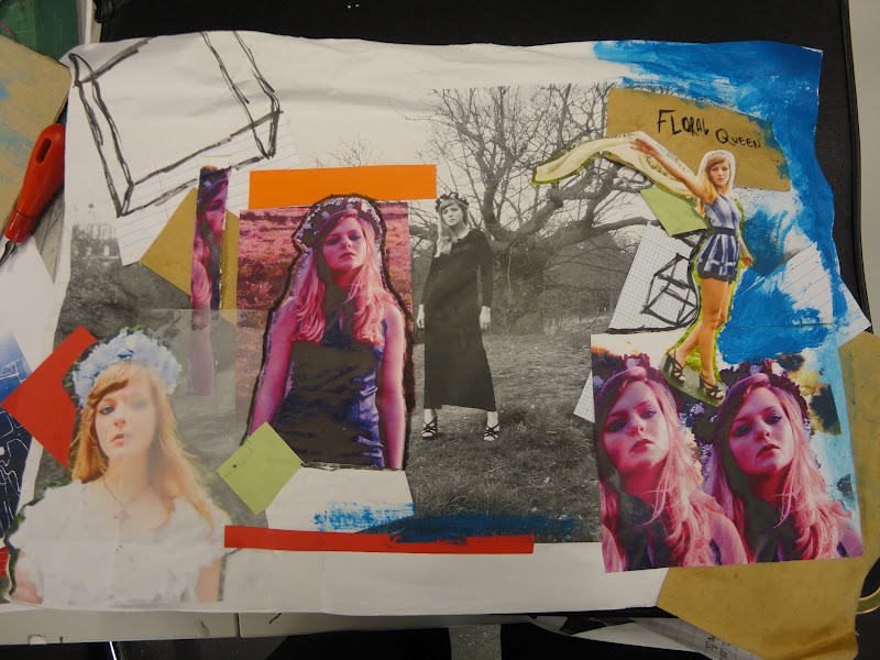
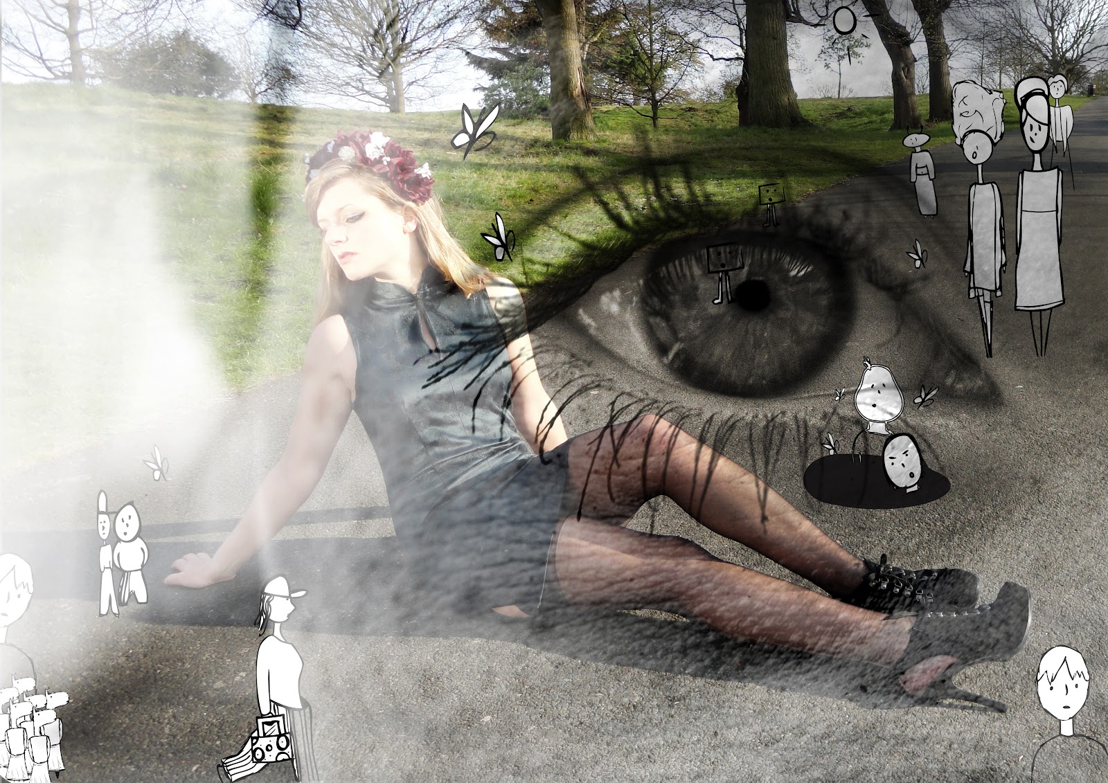
Inspired by Katy Lemay, Michelle Thompson and David Fullarton I created my own collages. I used various techniques for each, but the outcome is fairly good. As this was a pratice with this technique I didn't spend a lot of time creating the pieces, with more time I could make the designs more interesting using different types of paper like the artists I had researched. I used photography from newspapers and photography of myself and images I had taken myself to create the collage, then laid them on various types of paper such as graph paper and lined paper. In some of the images I used hand-written text do add diversity to the image, but for some of them I used type text cut outs from newspaper which I liked. Tracing paper was also used because I liked the transparency of the material, add a layer to the image, but because I had slight scrunched it up it was textured, appealing to the sense of touch.
David Fullarton uses graph paper, coloured paper, text, drawings, etc. in his work, and this looks great because there is a range of layers that come together on the piece. My work the layers are less interesting because I different experiments with a wide range of materials. In the future if I do this technique again I will use a range of materials, because the layered effect makes the image more eye-catching. I noticed that Fullarton's work has an humorous element to it, and wanted to try and bring that through in some of the pieces I create. "DJ Politics" linked to the latest political events in the News, and I wanted to add the funny side of it. I found this image, and the way the hands were positioned related to a DJ and I thought I would play on this idea.


This image uses photography from my Lana Del Rey inspired "Floral Queen" photo shoot. I edited some of the photos to alter the colour, then printed them and laid them on a bigger black and white photography that I had taken from the same photography shoot. I used various materials on this piece, taking my time to create work that related to the artists I have researched allowing me practice with this technique. Tracing paper, coloured card, pen, paint, lined paper and graph paper were used to create this piece, and I think the range of materials brought out the layers a lot more. I am more happy with this piece than the others, because I think it appeals to the sense of sight but also touch because I layered images. Although, there is not a humorous fun elements to the piece I think it goes well with the type photographs taken.