Sunday, 25 August 2013
CHECK OUT MY NEW BLOG
Blogger said I have filled up all photo limit so I have moved to http://photo-ife.tumblr.com/ check it out!
Wednesday, 9 May 2012
EVALUATION
This is my final piece. I created ten jar each representing me and people in some way, making it a piece of self-portraiture. Each jar shows things I have encountered and experienced in dreams and created these jars to illustrate my personality in a different way. This idea of jar art was not my original idea, but as I developed and began to research, I found an artist called Joseph Cornell (click here to see more about Cornell) who created various pieces of assemblage, which was created in boxes and jars. This work was creative and really stood out to me because of the creative use of 'found art'. In my final piece I have jars which have used ordinary objects but then transformed then to represent my experiences through life and dreams.
My journey to creating this piece began with choosing the 'packaging' brief, this brief was exciting and I saw me being able to expand this idea into something that can really represent me. I used jars for this piece which were used previously to store food but changed a basic object into something more creative and interesting that illustrated me.
Through the project I researched many different artists including David Shrigley, Piczo and David LaChappelle (click here to see the work of the photographers I researched), and even experimented creating photography and editing it in the style of various photographers, but I chose not to create a solely photographical piece like I originally wanted because I wanted to experiment with various techniques.

The origami jar
The patterns of the origami cranes which are not that clear were inspired by the repetitive patterns created by Ingo Giezendanner. I really liked Ingo Giezendanner, and wanted to create similar patterns in an origami crane. This jar came out well, although I change the style of it making the cranes stand up for themselves instead of using ribbon. The cranes look slightly sqaushed into the jar, so it could have be clearer what it was in the jar, but in real-life it is more clearer.

The Floral Jar
I used fake flowers and coloured water to create this jar. To colour the water I mixed purple ink and water.

Underwater jar
I like the outcome of this idea, and think it worked well with the theme. Although, this did not turn out as I hoped it still works well. I wanted the jar to be shakeable, but the shell inside has not stuck down to the jar properly so you cannot turn it upside down.


The floral queen jar


Happiness Jar


Evil and Darkness Jar

Gluttony Jar


This jar was inspired by Chrissie MacDonald
Ten Things I hate about you jar.


Tuesday, 8 May 2012
Jar Design - HAPPINESS


This is my happiness jar experiment. I used bright floral patterns because they looked quite summery because of the oranges and the yellows. I associate summer with happiness so thought to connect the two theme in one jar of happiness. I like this technique of using fabric in jars and it worked really well as a wallpaper for the jar. I learnt this technique from an online tutorial, and I really liked how it looked. I then went on to create my own jar with fabric inside. I am happy with the outcome of the trail, although it could have been neater and more presentable. I my final piece it will be neater, as I will have time to correct mistakes. After creating the fabric inside of the jar I will then use a candle to light up the jar like a lantern. The use of light links to the theme of happiness, as light is often a symbol of joy or happiness.
Jar Design Trails
Jar Design Trails
Below are trails I created with jars. I done this so I could practice with a range of techniques. A lot of these techniques related to Joseph Cornell's found art concepts, but my experiments are far more simplified. Creating these experiments allowed me to assessed what would be a success in my final piece and wouldn't. Coloured water works well and putting it in with other objects would look intriguing and weird.


Jar Design - 16 CANDLES
16 CANDLES
 16 candles is an 1984 teen film directed and written by John Hughes. The film is the story of 16 year old Samantha Barker played by Molly Ringwald and how her family have forgotten her 16th birthday. The storyline is quite cheesy with the girl likes cool older boy story, but this has to be one of my favorite film. As well as 16 Candles, I love a lot of the teens films directed by John Hughes during the 80s including "Pretty In Pink", "The Breakfast Club" and "Ferris Buller's Day Off". I wanted to create this jar to represent my love for the 80s classics, and how I always wished to be in a John Hughes film.

Images are still from film, but can be found on http://elysesnow.wordpress.com/
I am using 16 birthday candles in my piece to represent not only the film '16 Candles', but other films by John Hughes which I have loved. This jar represents me as a self-portrait on some of my film loves. Each candle will be individually decorated using ribbon, paint and other materials, as a way of making the piece more interesting and eye-catching. The candles will stand straight, as I will use super glue to attached the candles to the glass. I will also use ribbon to hang the numbers '1' and '6' from the lid of the jar, to show the number of candles. The lid of the jar will be painted pink with white stripes upon it, as a lot of these films are quite girly and romantic. I think pink is a colour represented with girls, so it is just a way to show this. The use of the white stripes is to make the lid more interesting to look at.
Jar Design - 10 THINGS I HATE ABOUT YOU
10 THINGS I HATE ABOUT YOU
 |
 I was inspired by their work, and after trailing the technique, I wanted to create a piece in my jar. I will use card as it is thicker than normal paper, and thus less likely to rip or tear. I want the piece to be fancy and quite feminine, so like my trail the writing will be in italics, and there will be swirls. The lid of the jar will be painted a reddish pink, which are the colours more commonly associated with love.
-The poem from the film
I hope to hand-cut this poem or parts of it and place it in the jar, as this is one of the main parts of the film.
-Heath Ledger

Australian born actor and Patrick Verona in film.
Images from: http://weheartit.com/
Jar Design - GLUTTONY
GLUTTONY
#Gluttony
- Noun
- The meaning of gluttony is to over-indulge in food and other items that one may deem as highly valuable to the extent that you become wasteful.
Gluttony is one of the seven deadly sins, which is a guide for the religious about the most serious of sins. Many people use this to determine whether they are a sinner or not, and many strictly follow these guidelines to ensure they too can get to Heaven.
- Claire Milbrath


Photography by Claire Milbrath: http://www.theardorous.com/portfolio/mundane-membrane/ and http://www.poorgray.blogspot.co.uk/
-The Jar
I wanted to create this jar is represent sins, and the sinfulness of people. Gluttony is just on of the deadly sins, but I thought this would be the most interesting one to show in a jar. In the jar I will layer various foods, making a food trifle, but the food is to look quite weird and disgusting, showing how sins are seen are disgusting to some people.
Jar Design - FEAR AND NIGHTMARES
 We all have fears, and one way our fears come to get us is through dreams; in the form of a nightmare. I wanted to represent what I encounter in my nightmares in this jar.
I found artist Arvida Bystrom, whilst I was researching photographers and found her style of work perfect when you think of nightmares. Born in Stockholm Bystorm has worked for many publications including Vice magazine, Garage magazine and Aftonbldet. Her work is quite dark and mystical, but I like the weirdness of the photography and editing. Bystrom used pastel colours such as pinks, blues and whites to create her piece. The colours are like cotton-candy, which is usually associated with children and funfairs, which makes it quite odd to appear on images with more of a dark theme. Despite the use of pastel colours the pieces still comes out as dark and evil. The contrast between colour and theme works well to enhance to weirdness of the piece.


This is my Arvida Bystrom inspired piece, where I used Adobe Illustrator to edit photography I had previously taken. The piece could have been neater, but as I did rush it, I think I could do a better outcome if I take my time.
FEARS!
The photography here was taken by me the edited into so that there are two layers of the same image. I like this image and think it works well be represent fears.
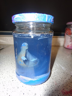
JELLY JAR


This is my jelly jar trail to represent fears and nightmares. I used green jelly because it looks quite slimey and a good way to represent nightmares. Inside the jar were nails, and parts of a toys, as I wanted to create something quite weird. I hope for the oddness of the work to attraction viewers to take a closer look. When experimenting with this technique I learnt that I would have to layer the jelly so objects could appear like they are floating. The mixture of the jelly was different to when cooking normal jelly. The mixture was mostly jelly with little water, which in an exam may prove at a constraint, but with access to a kettle and a fridge this should be achievable. For the exam for this jar I will use more objects, as this jar is not as odd as I would have liked, I want to add plastic insects, reptiles, amphibians, etc. as many people have a fear of these types of creatures. I will use a proper doll's arm in the final piece as it looks more realistic.
Subscribe to:
Posts (Atom)