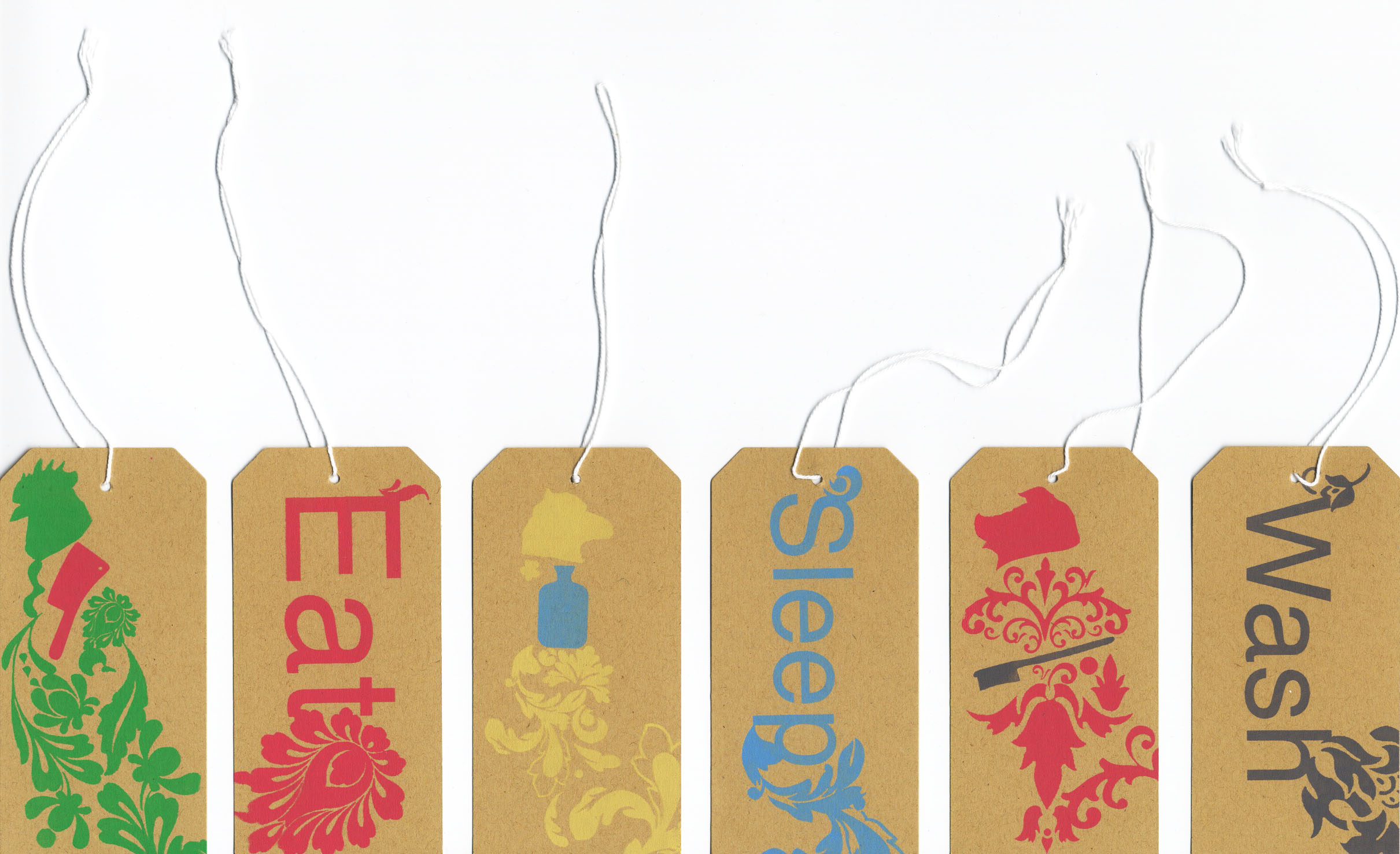
Ashley Potter

These are swing tags created by Ashley Potter, an Illustration graduate from Plymouth University. I like these swing tags because they are simple in shape and colour, but the text gets the message across. I like the use of patterns on the swing tag, and the contrast of light blue, green, pink and grey text upon a brown background. I like how the background design, does not distract from the information trying to be given. I think the swing tag looks quite natural, and has an environmentally friendly feel about it. This is just one example of how a swing tag, can suggest a theme or idea. This logo for example looks like it is aimed at an older woman (18+) because the design is quite feminine. The colours used are quite light, which also suggest that the targeted consumers are women. I think this would better suit an adult woman, because the design is quite formal, and appears to be for a product that adults would buy. The brown card as the base, links to this idea of being green, ad highlights how he looks of a swing tag can translate to others what the shop is about.
I hope to create a swing tag for my fancy dress boutique. Looking at this will help me further my swing tag ideas.
Source of image: http://www.free-range.org.uk/
No comments:
Post a Comment