Pages

Showing posts with label experiments. Show all posts

Tuesday, 8 May 2012

Jar Design Trails

Jar Design Trails

Below are trails I created with jars. I done this so I could practice with a range of techniques. A lot of these techniques related to Joseph Cornell's found art concepts, but my experiments are far more simplified. Creating these experiments allowed me to assessed what would be a success in my final piece and wouldn't. Coloured water works well and putting it in with other objects would look intriguing and weird.


Monday, 7 May 2012

Paper Art - hand-cut paper, stencils and other cutting techniques

Caroline Jane Harris


This is the work of artist Caroline Jane Harris. I really like her intricately cut pieces, and the organic nature of the work.  The detail in the work is beautiful, and to see paper cut in this way is so intriguing and looking at the work always brings me to take a closer look at the image. There is no excessive use of colour which works when with the images so you can focus on the patterns, and the image that has been created from the cut out. The work looks so fragile, but shows how paper can be used in other exciting way. The cuts are finely done and I think it's when you see images like this in real-life that you gain a proper insight into it's beauty. Some of the pieces look like snow flakes under a microscopes, reminding me of winter and the ice queen. This effect makes the work look quite cold which works well with the fragile nature of the work.
More of Caroline Jane Harris' work can be found here: http://www.carolinejaneharris.com


Aoyama Hina

Paper Cutting Art by Aoyama Hina

In contrast to Caroline Jane Harris' work Aoyama Hina hand-cut her pieces. I think both artists have amazing pieces of work and Aoyama Hina's pieces are auntie feminine and pretty. Her work does amaze me to think that only a scissor and paper was used to create such a delicate image. I really like the effect of the work.
More of  Aoyama Hina's work can be found here: http://www.toxel.com/


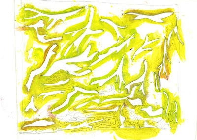
My Hand-cut paper designs. 


These are my hand-cut paper designs. My designs are not as intricate as the designs of Caroline Jane Harris and Aoyama Hina, but I wanted to practice with this techniques because I really liked it. Using the stencil I had created, I then created prints using inks and bleaches on firstly paper then tissue. The pieces were more of an extension of the previous experiments with ink and bleach I had created. Have a look http://ifeakinroyejegraphics.blogspot.co.uk/2012/05/ink-and-bleach.html 


Creating a hand-cut paper piece.


I like the outcome of the work, but if I am to continue with this technique I would like to produce creating something a littler more finer like the paper artists I had discovered.


Playing around with photoshop

-Changing Hair Colour


 Above is a photography I had previously taken, but wanted to further experiment with it, as my final piece will contain photography this was to practice with editing techniques. The photograph is quite a dramatic portrait putting the main focus on the subject at the centre of the image. The image is clear, so I each part of the photograph is defined. In Adobe Photoshop I change the hair colour of the subject, so I could trail how to do this technique. I used pink colours to do this, to highlight a major change in the hair colour. I think it also goes with the dramatic nature of the photograph. Making it look edgy.


Again I have edited a previous photo from a photo shoot I had done in the past. The photograph was a simple portrait, with the subject holding a prop which symbolised her. The use of props to emphasise characteristics was used in the photographer's Piczo's work which I really loved FIND HERE.

In this photograph the prop emphasises the childishness in the subject, and I used purple and browns colours to colour the hair as it adds a fantasy child-like element to the photograph relating to the prop.

Ink and Bleach

Ink and Bleach

Here are ink and bleach pieces that created by various artists. I like this technique because the ink is strong whilst the bleach washes it out. The washed out effect that is created by ink and bleach works well to create pieces that are quite expressive, like the artist has created the piece with a story in mind. I like this about bleach and ink, even if it is just smudges and mix of colours there is something expressive about it. The brush strokes created with the ink and the bleach are often quite smooth, and the bleach adds textures to the image. There is also a layering affect, as the bleach stains the smoothness.  In the first image the outline and textures of the fishes are created with the bleach, showing how bleach can be used on ink to create a picture. The second image also uses paint on the ink and bleach, mixing a range of materials. Through the white paint the bleach comes through fainting making each individual layer visible on each layer. I like image two because it looks like the galaxy or a night sky. Images three and four are expressive. The ink has been used sketchly, and then brush strokes of bleach have been on top of it. The strokes of bleach are expressive and the images appear quite empowering as the woman is dressed as a superhero.


My bleach and ink trail


This is my bleach and ink trail, which I created on tissues. I used tissue as a based, because I wanted the ink to spread freely. I then used brown ink and bleach to stain the tissue and the ink. I like the symmetry in the image and the tie-dye effect. These patterns came out as I wished. With more time I would have practised this technique on a range of different surfaces to try and create different effects.

Tuesday, 24 April 2012

PAPER


My experiments with paper. I tired to experiment with how I can make designs out of paper, it was interesting to see how paper can create various objects. 


Drawing still life

Inspired by artists such as Hennie Haworth (image to the left) Who draws using materials such as biro and pens; I created some pieces of my own. I wanted the drawing to look quite girly so I could try a different style of work. I drew different stationary in my pencil case, using biro and coloured pen. The drawings are simple, but they were just practices to see if I could create a piece in this style. I like the style of drawing, but I think I would like to mix media, so maybe use photography and drawings, so the piece becomes more interesting. I think with more practice my drawings can improve, so if I decide to use this technique for my final piece, I will need to practice more. Below are my experiments


Monday, 5 March 2012

Portraits of me


These are portraits of myself from when I was younger, which I altered in various ways. I used biro, makers, tracing paper and various other types of paper, to add effects onto my portrait. I was inspired by artist Francisco Nicolás who does photography, and adds shapes onto the landscapes. I like the mix of illustrations and photography, so trailing it helped me to experiement with how it would look. I think they turned out well, but could be neatened up.

Saturday, 21 January 2012

Graphics Retail Project: Swing Tag Experiments


Swing Tag Experiments

Hand Drawn initial ideas for a swing tag


Initial ideas for the shape of the swing tag. Adobe Illustrator used to create this.


These are my swing tag experiments. I done this so I could gain a better understanding of what swings would work best. I like the experiments, and having the ALBOE character somewhere within the log works really well. Experiments, trying to find designs which work best for my swing tag. I tired to make them quite simple, because after looking at other swing tag designs, i saw simplicity as quite important.

Graphics Retail Project: More Surface Design Experiments

Surface Design in Net


These are collages of previously hand-drawn designs which I edited using Adobe Photoshop. I used the gradient tool to experiment with different colours. I like the different colours, and the way this has come out. I think this will look better for the surface of the inside of the box, and then I do further experiments for the outside of the box.