Pages

Showing posts with label illustrator. Show all posts

Friday, 4 May 2012

Artist Inspiration - Ingo Giezendanner

Ingo Giezendanner


This is the work of artist Ingo Giezendanner, who works to create installations, paintings and drawings. The work below are some of his drawings created with pen and paper. I like these pieces because of the repeated patterns. Some of his work are a landscapes and street (see above photography), but some of my favourite pieces but Giezendanner are his repetitive patterns (see below photography).

The use of simple black and white colours make the drawing stand out as the black appears emboldened. I really like the use of repeated patterns to create a whole image.


Ingo Giezendanner's work: http://grrrr.net/


Here I combined Ingo Giezendanner inspired repetitive patterns with a photograph I had previously taken.


Katy Lemay, Michelle Thompson and David Fullarton

The work of Katy Lemay stands out to me because of the mix media techniques used within the piece. I then went on to look at the works of Michelle Tompson, and really liked this work also. I like the use of photography, typography and different techniques used. I think this is a good way to present imagery, and take a photography one step further. David Fullarton is another artist who uses this mix media combination to create a textured image that stand out.

Katy developed an overwhelming passion for illustration while completing her Bachelor of Graphic Design at the University of Quebec in Montreal. It was also during that time that Katy created her unique style

Katy Lemay


Katy developed an overwhelming passion for illustration while completing her Bachelor of Graphic Design at the University of Quebec in Montreal. It was also during that time that Katy created her unique style.vvvv


Katy Lemay's work is really great because of the playful combination of photography and illustrations. The use of children in the pieces reminds of a children's book, and the bright colours used look like it appeals to children as well. I like the use of black and white photography upon the colourful drawings and painting.
Katy developed an overwhelming passion for illustration while completing her Bachelor of Graphic Design at the University of Quebec in Montreal. It was also during that time that Katy created her unique style.
Source: http://www.agoodson.com/katy-lemay/


Michelle Tompson


Michelle Thompson is an illustrator, but also creates a range of mixed media pieces which combine photography, books, scraps and other materials. Thompson's client list includes BBC, The Guardian and Reebok. The photography used by Thompson appears more older film photography which she has re-used and transformed into a modern creation. A lot of her work have meanings behind it which she has produced for campaigns such as bullying or divorce. I like that she has used her talent to create campaigns, and used old photography and transformed it into something new.


Source: http://www.michelle-thompson.com/


David Fullarton


David Fullarton uses a mix of materials to create humorous pieces which have been produced for a range of clients. I like the layering in the work, as you can see the use of graph paper, illustration and various other types of paper which have been placed together to create a bigger image. I find the work interesting to look at, as it's colourful, but not too bold. The humour within the pieces also adds to my interest in the work.

Source: http://www.davidfullarton.com/ 


Inspired by Katy Lemay, Michelle Thompson and David Fullarton I created my own collages. I used various techniques for each, but the outcome is fairly good. As this was a pratice with this technique I didn't spend a lot of time creating the pieces, with more time I could make the designs more interesting using different types of paper like the artists I had researched. I used photography from newspapers and photography of myself and images I had taken myself to create the collage, then laid them on various types of paper such as graph paper and lined paper. In some of the images I used hand-written text do add diversity to the image, but for some of them I used type text cut outs from newspaper which I liked. Tracing paper was also used because I liked the transparency of the material, add a layer to the image, but because I had slight scrunched it up it was textured, appealing to the sense of touch.

David Fullarton uses graph paper, coloured paper, text, drawings, etc. in his work, and this looks great because there is a range of layers that come together on the piece. My work the layers are less interesting because I different experiments with a wide range of materials. In the future if I do this technique again I will use a range of materials, because the layered effect makes the image more eye-catching. I noticed that Fullarton's work has an humorous element to it, and wanted to try and bring that through in some of the pieces I create. "DJ Politics" linked to the latest political events in the News, and I wanted to add the funny side of it. I found this image, and the way the hands were positioned related to a DJ and I thought I would play on this idea. 


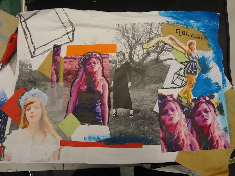
This image uses photography from my Lana Del Rey inspired "Floral Queen" photo shoot. I edited some of the photos to alter the colour, then printed them and laid them on a bigger black and white photography that I had taken from the same photography shoot. I used various materials on this piece, taking my time to create work that related to the artists I have researched allowing me practice with this technique. Tracing paper, coloured card, pen, paint, lined paper and graph paper were used to create this piece, and I think the range of materials brought out the layers a lot more. I am more happy with this piece than the others, because I think it appeals to the sense of sight but also touch because I layered images. Although, there is not a humorous fun elements to the piece I think it goes well with the type photographs taken.


Johan Thörnqvist - illustration and photography

Johan Thörnqvist


 I like the work of artist Johan Thörnqvist who combines photography and illustration to create quirky and cool pieces.  Johan Thörnqvist photographs a range of destinations, then edits and draws onto the photography. The combination of  cartoons and real life is really interesting to look at, giving a dream-like affect. I think the work is very cleverly done, using space well. For example turning the mug into sea where the ship sails. The work is fun appealing to children, but also families because of the use of a mother and daughter in some pieces. I think these pieces can appeal to a wide audience just because of the element of fun put into it.


The image below is of a lamp, but  Johan Thörnqvist has transformed an ordinary object into something interesting and eye-catching. I really like the idea of using something ordinary and transforming it to something surreal or dream-like, which  Johan Thörnqvist  has done.


More of  Johan Thörnqvist  work can be found here http://www.snarlik.se/


My Johan Thörnqvist inspired work.


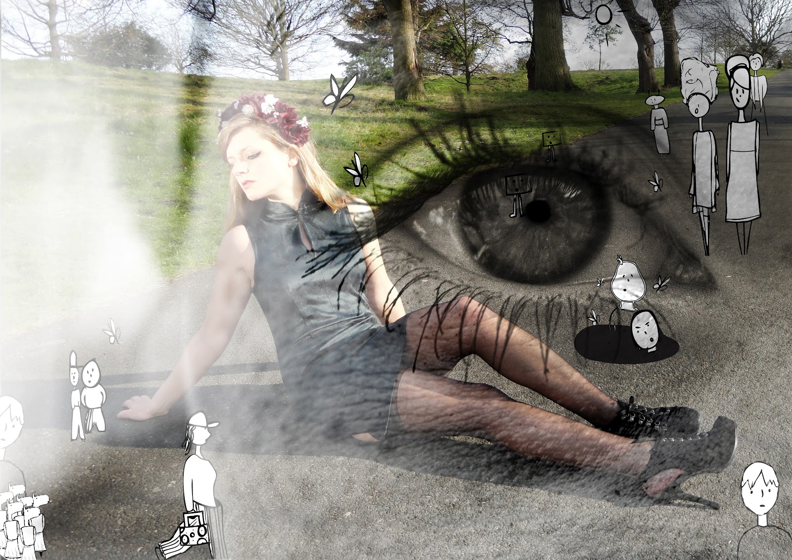
This is the Andrew Rae inspired illustrations I created, and decided to take these experiments one step further. Inspired by Johan Thörnqvist's combination of illustration and photography, I went on to create my own. I first used Adobe Photoshop to separate the illustrations I created, then inserted the separated illustrations into Adobe Illustrator, so it is easier to play around with them. On Adobe Illustrator I used the 'Live Trace' tool, then 'expand' to remove the background of the illustrations and have the possibility to change the colours or edit part of the illustration. After this I inserted a photograph I had taken from my Lana Del Rey inspired floral photo shoot, which I used for the "Floral Queen" jar. I used this photograph because the position of the subject is perfect, as she has space around her and lays on the ground. I was about to play around with this, positioning the illustrations in various positions, till I found which suited the photography best. I used repetition of some images, to fill part of the photograph and I think this worked because all the personalities fit together.

I really liked Johan Thörnqvist's work, and wanted to create an image that combinated real-life and cartoons together, but whilst doing this I wanted to use photography which was in my own style, so an element of myself could be brought through.


After creating this image, I furhter edited the photography in Adobe Photoshop, as I saw some of Johan Thörnqvist's pieces looked like it had a coloured filter on it. In Photoshop I used the gradient map to colour the images. Firstly making it look like a light purple filter, then a green one. I added contrast and altered the brightness of the photography, so make sure the image was clear, and all part of it were defined and how I wished for it too appear. I think the colouring works well, but I do prefer the photo in it's original colour as it looks more simple but also realistic.


Below I continued to trail with the Johan Thörnqvist inspired piece I had created, but layered the image to give another dimension. With previous photography of eyes I had done using a zoom lens, I laid eye photograpy and Johan Thörnqvist inspired work upon each other, then edited using 'blending change', 'opacitiy' and 'fill'. I do like the use of the eye, because then it suggests this as imagination, but I am unsure if it looks as good as it could. The last image lays three images together, a photograph of an eye I had taken, the Johan Thörnqvist inspired piece and a portrait from the Lana Del Ret inspired work.


Thursday, 3 May 2012

Inspirational work: Peepshow Collective


The Peepshow Collective

I have been a fan of Chrissie Macdonald's work for a while now, and recently I found this collective she is part of; Peepshow. Peepshow is a collective of illustrators Luke Best, Jenny Bowers, Miles Donovan, Chrissie Macdonald, Pete Mellor, Marie O’Connor, Andrew Rae, Elliot Thoburn, Lucy Vigrass and Spencer Wilson. I really liked the various artists I discovered in the collective and one artist that I really like was Andrew Rae, who uses a mix of humor and personification to make some interesting illustrations.

More about the Peepshow Collective can be found here on http://www.peepshow.org.uk/


Andrew Rae


Andrew Rae has worked for various clients including Nike, MTV and The Guardian. Similar to the work of artist David Shirley another illustrator with work I like Rae creates pieces that mix of art with comical. I really like the combination of illustration and comedy, as the piece provokes a response from the audience. I like the way in which Rae presents people and animals in his pieces, giving them characteristics and qualities which show through the picture. The rabbit on the left has been drawn in black pen on a white background. It is a line drawing but even despite it's simplicity it is skill, and makes the rabbit look quite mischievous. The images with all the characters below is one of my favourite by Rae as it has a range of various character on it. Each character is individual and different from another. When you take a closer look you can see a different personality in each character, as if each have their own story. The use of colour especially in the illustration below is very important to highlight the differences in personalities, as colour can suggests various things, or give perceptions such as pink for girls. Rae plays on this giving one of the male illustrated characters a pink T-shirt, whilst he has a shaven bald head. This contrast with perceptions we would usually have of men causing humor. This highlights how colour can also provoke emotion from the audience as well as the illustration itself. When creating my piece I will take into account the various colours I use, as I want to interest the audience and provoke a response, so selecting an appropriate colour will impact on the response (if any) I gained from the audience.

I think Andrew Rae's work is great to look at for Journeys, Encounters and Meetings because the use of 'people' show different things Rae has encountered through life whether it be a dream or in real life.

The personification of animals and objects adds to the humor of the illustration making it fun to look at. In the illustration below there is a blue bear with a walking stick this and a horse with a gun. I think creating drawing that have personality is a great way of connecting with the audience and Rae does this well.


Characters -

More of Andrew Rae can be found on http://www.andrewrae.org.uk/


My Andrew Rae inspired pieces


I used fine liner pen on graph paper to create this Andrew Rae inspired piece. I cartoonised my oyster card, as relating to how Rae cartoonised people. This trail did not come out as I had hoped, and to make it more like Andrew Rae I could have made the illustration more humorous.


This is my second Andrew Rae inspired piece. For this I created various characters, giving them each different characteristics. I noticed Rae used this technique to make his cartoons interesting and wanted to try drawing various characters with their own personality. 


Creative Review Shredder - Photography John Short

Chrissie Macdonald

Chrissie Macdonald is also part of the Peepshow collective and a different style artist to Andrew Rae. I really like the work of Macdonald and she has inspired a lot of previous work I have created. I now look at her again, as I believe the paper pieces she creates could be something I consider for my piece. 

With clients including Central Saint Martins, Creative Review, Dazed & Confused and Edinburgh Fringe Festival, Chrissie Macdonald is a successful artist, who uses predominantly paper as a medium. Her use of photography and paper creates exciting scenes. 


Above is Chrissie Macdonald's commission for Orange phone company. This too is created by paper. Here Macdonald has uterlised paper to create shapes that have become characters. Similar to the work of Andrew Rae each character has been given its own personality. I like this because then each character is eye-catching and you want to look at each one. I really like the use of different shapes, there is a range of size and shape, which suggests something different. The cuboid with the top hat is really interesting being the tallest of the shapes.  It looks quite clever, and businessman like, relating to our perceptions of British businessmen; suit wearer, top hat, eye glass and tall. The use of the orange is a clever way to promote the phone company Orange through the piece, and therefore the Orange logo is very small and place in the corner of the piece.

New York Times Magazine - Photography John Short

This is a piece created for The New York Times Magazine. I like it because of the mysterious almost ghostly atmosphere created by the green lighting. It looks like a scene from a horror film with black cats, a lift and a small child, creating a sense of spookiness or even fear. I think this mix of photography and paper is something I will practice and use in the future within my piece because it is great to look at.

More of Chrissie Macdonald can be found on http://www.chrissiemacdonald.co.uk/


Chrissie Macdonald and Andrew Rae


Chrissie Macdonald and Andrew Rae teamed up together to create an installation for New Royal London 
Hospital, routes to childrens' theatre. The piece is mixed media created with paint and fabric. I think the piece works well to target young children because it is playful and fun. It creates characters a boy and a girl and it appears like they are going on an adventures, because of the different scenes captured in the work.


Work can be found here on Andrew Rae's website http://www.andrewrae.org.uk


Photographer and Illustrator - Heikki Leis

Heikki Leis


Illustrations


Photography


I really like the work of Estonian artist Heikki Leis. When I initially came across his photographic work, I found it really quite interesting how one object or prop was used to describe someone. It is quite intriguing looking at his work, as I begin to imagine the story behind it. Leis photography grabs my attention and this is probably why I like it so much. When I saw this I wanted to create something that had the same affect one my audience.

Heikki Leis is both an illustrator and photographer. Leis illustrations created from pencil and pens are amazing to look at as well, appearing almost photo-like.

Work such as this is inspiring because through a photo you begin to think of a story. Although my final piece may not definitely be a photography only based piece I think when I do create my work I will take Leis' work into account. Creating something that tells a story, draws in an audience to think.

More of Heikki Leis work can be found on http://www.heikkileis.ee/